I’ve seen some of the most beautiful sights in the world on my travels, and have captured many in photographs. There were times when I was looking at the riot of color at the Floating Market in Bangkok, the cherry blossoms in Japan, or the prospect from the Great Wall of China, and I wished I could capture that in paint. Not “would”, but “could”. Trying to see if I had the ability to do that one day was what ultimately led me to take a drawing class. What kept me from signing up earlier was the certainty I would have to draw a human at some point. Murphy’s Law.
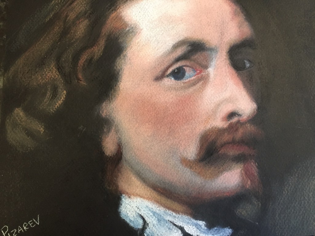
Damn Murphy. Of course, the first subject I get in painting class is to reproduce Van Dyck’s Self Portrait. Right. Adding to the intimidation factor, not only do I get to do a face, but I have to make a reasonable facsimile of a work by a Great Master. I had no idea how to draw an eye or a nose, and now I get to draw one of the most famous noses in art – in pastel, a medium that is completely new to me. I set up my workspace and prepared to Do This. After all, this is what retirement is all about – trying new things and facing fears.
 First up was drawing the shape in white charcoal on the black Mi-Teinte paper. Face is here. Eyes about here. Chin and goatee here. Nose (gack!) here. Shirt here. Then, lay in a light layer of pale pastel where the skin needs to be. What I ended up with was something that looked like a bad propaganda poster, but at least it showed me where things were going to go. It also made me a bit less nervous, seeing something going on the paper.
Next step was getting the skin tone right. Working in nupastel is essentially drawing with chalk, and the last time I did that, I was drawing hopscotch on the sidewalk. Back then, I didn’t need to layer different colors on top of each other to get the exact tint I wished.
The goatee gave me fits. There were several different colors of brown and red in the original, so I did the best I could. Bob came by my easel at that point to check on my work, and said that I made the same mistake most children do when drawing hair. I had to remind him my last art lesson was at the tender age of 12, so OF COURSE my first effort was using those techniques. The rest of the class laughed at my embarrassment, and Bob chuckled as he showed me how to treat the hair as a shape first and then add detail at the very end. One of my classmates patted my shoulder as she walked by in sympathy.
Did you know the white of the eye really isn’t white? Nope. It’s pale pink and pale blue, depending on the shadow. It’s about value, not color. Beard shading is gray layered on a mixture of peach and a few brown tones. Shadow below the ear and chin? A deep red-brown overlaid with black. Highlights are a pale yellow or a pale pink lightly or deeply applied and pressed into the paper. The nostril was every bit as difficult as I thought it would be, but fortunately, if you make a mistake, you can brush it away and fix it.
After a few weeks of Fun With Van Dyck, I realized we both had enough. The paper wouldn’t take another layer of pastel, and I was pretty sick of his handsome face. I’m sure he was tired of being taped to my easel as well. My first portrait – my first pastel -was as finished as it would ever be. I decided to keep The Old Boy as a baseline, to compare with future efforts so I can gauge my progress. I hope to be able to look at him and say – “Wow, I was awful back then”.
What am I most proud of? I stepped out of my comfort zone, and gave my biggest fear a valiant effort. I’m not afraid to show the world that I am no longer scared of the human face. I can do this, and that makes me feel pretty damn good.
Which is fortunate, because I just got my next assignment. Vélasquez’s famous portrait – that I’ve actually seen in it’s original glory. This is going to make Van Dyck look easy.
Back to the drawing board.

